TL;DR
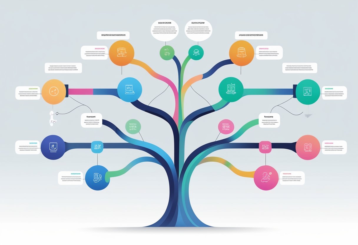
We build outcome trees that connect inputs to outputs to product outcomes to business impact. Each node gets a metric to track progress.
We keep trees to one page with three or fewer funded paths. Extra details go in an appendix.
Leading metrics sit near inputs. Lagging metrics track business impact.
We add quick math to show “if this, then that” relationships.
During reviews, we highlight two paths and use RAG colors. We also show the counterfactual—what we’re not doing.
We refresh trees monthly and cut branches that miss leading thresholds.
What is an outcome tree?
An outcome tree maps what your team does to business results. It shows a path from inputs to outputs to outcomes to impact.
The tree starts with input—what your team will actually do. This connects to output—how many users see or use your work.
Output leads to product outcome—changes in user behavior or quality. Finally, this creates business impact—effects on revenue, retention, or profit margins.
Input → Output → Product Outcome → Business ImpactMost outcome trees fail because they have too many branches and use vague descriptions. They often lack numbers to measure success.
We do it differently. Every step is a measurable change with hard numbers. We keep trees simple with fewer branches and do quick impact checks every 30 seconds to stay on track.
The four layers (with quick prompts)
Each layer builds on the next to connect work to results.
Input covers what we’ll do this cycle. We ask, “What concrete action unlocks value fastest?” Maybe we add sample data plus ‘Copy cURL’ to API onboarding.
Output identifies who sees or touches our work. The prompt is, “What % of target users will experience it?” This could be the percentage of new signups who run one API call.
Product outcome (leading) defines the behavior we want to see. We ask, “What behavior shifts within a week?” Maybe TTFV drops from 30 to 5 minutes, and activation jumps by 10 points.
Business impact (lagging) captures the result that pays the bills. The key question is, “Which single metric moves if we’re right?” For example, expansion ARR increases by $1M in H2.
Build your tree in 45 minutes
We set our root in the first five minutes. Pick one impact metric with targets. Name one or two guardrails to keep us honest.
Next, we draft our paths from minutes five to twenty. For each idea, we write one line: Input → Output → Product outcome → Impact. This keeps things clear.
From minutes twenty to thirty-five, we add baselines and targets. Use one or two metrics per node. Make sure we can pull these metrics weekly.
Finally, we cut and commit in the last ten minutes. We keep two or three paths. Everything else goes to the parking lot for later.
If we can’t measure a node within our cycle, it belongs in the appendix, not on our tree.
Example A (B2B developer platform — concise)
We focused on expansion ARR with two guardrails: P95 latency under 200ms and margin above 65%.
Our first initiative targeted new developer signups. We added sample data with a ‘Copy cURL’ button to increase the percentage of signups who run their first API call.
This reduced time to first value under 5 minutes and boosted activation by 10 points.
The second initiative addressed budget management. We built budget alerts and caps to increase the percentage of workspaces with budgets set.
This reduced overage churn risk by 25%.
Quick math breakdown:
- 10 point activation increase × 30k monthly signups = 3,000 activated teams
- $4/month average expansion uplift = $144k/quarter, annualized at $576k
- Alerts cut churn on 4k-team cohort by 25% at $120 ARPA = $120k/quarter saved, annualized at $480k
Both initiatives target $1.0M expansion ARR impact. Total estimated impact: $1.06M annually with about 70% confidence.
Example B (B2C fitness app — concise)
Our fitness app tracks 90-day subscriber retention as the primary metric. Guardrails: refund rates under 5% and crash-free sessions above 99.6%.
The experiment tests a 7-day beginner plan with optimized push timing. We measure how many new users complete their first workout day.
Impact Chain:
- Input: 7-day beginner plan + push cadence
- Leading metric: % new users complete Day 1
- Day-7 streaks: +8 points
- 90-day retention: +3 points
A 3-point retention increase across 200,000 subscribers means 6,000 extra retained users monthly at $10 average revenue per user. That’s $60,000 per month in extra revenue.
How to present it (3-slide exec script)
Slide 1 starts with your main goal and key numbers. State the expansion ARR target. Explain the two main ways you’ll reach the goal.
Slide 2 shows both paths with their current status. Use green and amber to mark progress. Path A covers activation timing and output exposure rates. Path B focuses on budgets and churn risk. Include your decision rule with date and action plan.
Slide 3 covers what you chose not to fund. Mention the SDK rewrite option and its projected value. State when you’ll review this choice again.
Metrics: what goes where
Inputs track our feature flag percentage, template display rates, and message reach.
Outputs measure exposure, click-through rates, and user trial percentages.
Product outcomes include activation rates, time to first value, task success, frequency, and quality metrics like error rates.
Impact metrics cover retention and revenue.
Guardrails monitor reliability, cost, and support load.
One-page template (lightweight)
This template tracks product outcomes and impact in a simple format. We fill in the product segment, owner name, and last update date at the top.
Key sections include:
- Impact goal – Our north star metric with target date
- Guardrails – Metrics we monitor to avoid negative effects
- Funded paths – Current projects with inputs, outputs, and success checkpoints
- Parked ideas – Future opportunities we’ll revisit later
- Risks – Potential blockers and our mitigation plans
Pre-read checklist (5 items)
- One root metric plus 1-2 guardrails – We define our main success measure and protective boundaries
- Maximum 3 funded paths – Each path includes baseline numbers, target goals, and quick math validation
- Measurable delta nodes – We write specific, quantifiable changes instead of vague version names
- Leading metric checkpoints – Our progress markers connect to predictive data, not presentation schedules
- Clear counterfactual – We explicitly state what approaches we are not pursuing
Glossary (fast definitions)
RAG
RAG stands for Red/Amber/Green status. We use this system in reviews to show how projects are doing.
Red means problems. Amber means some concerns. Green means everything is on track.
This color system helps teams quickly spot project health without reading long reports.
TTFV
TTFV means Time-to-first-value. This measures how long it takes until a user experiences the core value of our product.
We track this because faster time to value usually means better user retention. When users see value quickly, they stick around longer.
Elasticity
Elasticity shows how much one metric changes when another metric moves. We use this as a rule-of-thumb for planning.
For example, if we improve activation by 1 point, retention might go up by 0.25 points. We use ranges instead of exact numbers because these relationships aren’t perfect.
Final tip
Try telling a clear story in four parts: Outcome → Path → Evidence → Decision.
Stick to one sentence for each part. Round your numbers—no need to get fancy or overcomplicate things.
Only mention the branches you actually plan to fund.