
User experience designers lean on specific patterns to help people navigate digital products. These patterns tackle common hurdles folks face when using websites and apps.

Three design patterns really make a difference for user engagement and clarity. Aha discovery moments show value early, progressive profiling gathers info bit by bit, and empty-state patterns steer users when content’s missing or loading.
TL;DR
We see activation as one clear outcome—not just a product tour. Our first-run experience aims to get users to that moment fast.
We kick things off with aha tasks that deliver immediate value. Smart empty states help when there’s no content. Progressive profiling means we wait to ask for info until later.
We track exposures, actions, and time-to-value (TTV) to see how we’re doing. Feature flags let us roll out changes safely.
We use quick expected-value math to pick what ships Now versus Next.
Our guardrails: privacy by default, WCAG 2.1 AA compliance, and no dark patterns.
Key definitions (one line each)
Activation: When a new user first gets core value from your product.
Aha moment: The smallest action that reliably sparks user activation.
First-run: The time from sign-up until a user activates or leaves.
Progressive profiling: Only ask for what’s essential now—save other questions till after users see value.
Empty state: A blank screen designed to teach and nudge users toward their first valuable action.
TTV (time-to-value): Minutes from sign-up to activation.
Guardrail metric: A check to make sure we’re not causing harm, like tracking complaint or error rates.
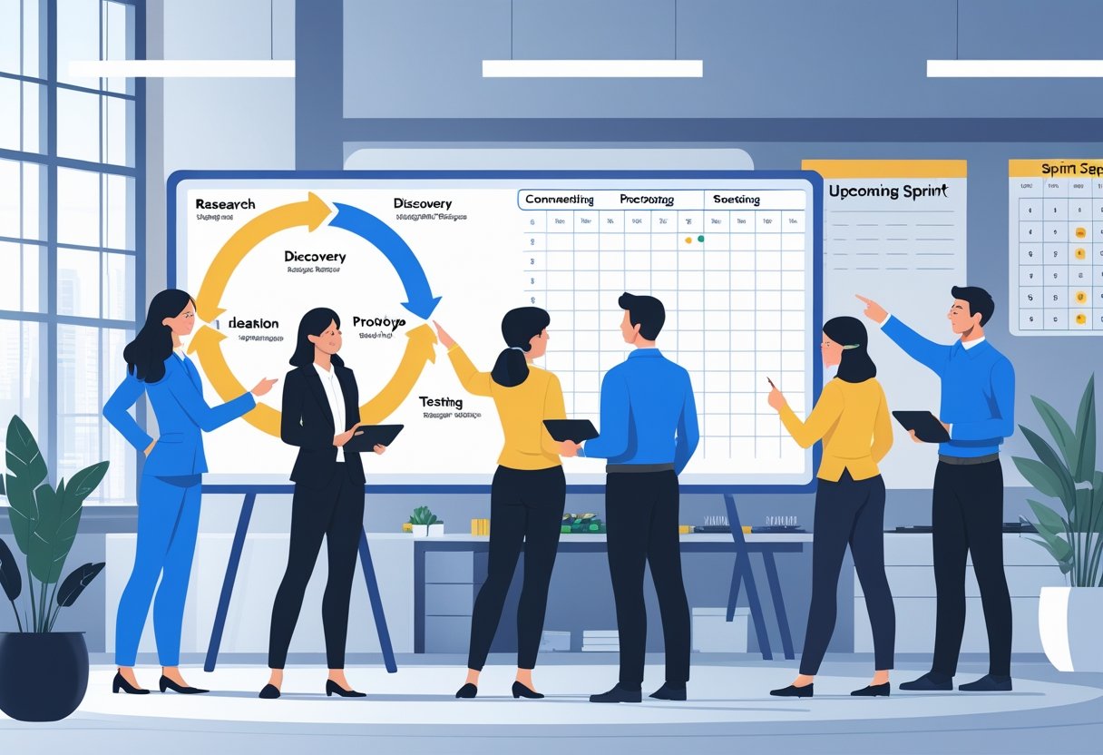
The 7-step playbook for activation-driven onboarding
1) Define activation and Aha (in writing)
We start by choosing a single activation event. Maybe it’s “Created 1 project and invited 2 teammates” or whatever fits your product best.
Next, we map the Aha path, like “Connect a data source → see first chart.” We keep it simple.
We also set a measurement window—say, 7 days—so we can compare results over time.
2) Map the first-run path (≤5 steps)
Our journey looks like this: Landing → Sign-up → First screen → First action → Activation.
We list every blocker that might trip up users: permissions, emails, billing, integrations, invites. If something doesn’t help users reach their Aha moment, we cut or delay it.
3) Design empty states that teach by doing
Each empty state we build includes five things:
- What this is in one quick line
- Why it matters (focus on value, not features)
- One main action with a big call-to-action
- Sample or demo data if live data’s tough to get
- Help options—maybe a 40-second video, docs, or “Try a sample”
4) Use progressive profiling (defer non-essentials)
We gather info in steps:
- At sign-up: email plus SSO
- After Aha: role and team info
- After activation: industry and company size
- Billing: only at clear value points—like usage limits or trial end
5) Replace tours with a guided first task
We offer a checklist of 3-5 tasks, ending at activation. All tasks happen right in the product, like “Connect Slack” or “Create first rule.”
We auto-complete steps as users do them naturally. Users can go in any order they like.
6) Instrument and alert
We track exposures, step conversion, time to value, activation rate, and drop-offs. Our dashboard shows activation %, time to value, step funnel, and guardrails.
We set alerts for sudden spikes in errors or complaints during rollouts.
7) Roll out safely and iterate
We ship behind feature flags: 5% → 25% → 50% → 100%. Each step gets enough time to measure results and check guardrails.
We keep a 5-10% control group for 1-2 weeks after full rollout. That helps us spot any issues.
Trade-offs you’ll face
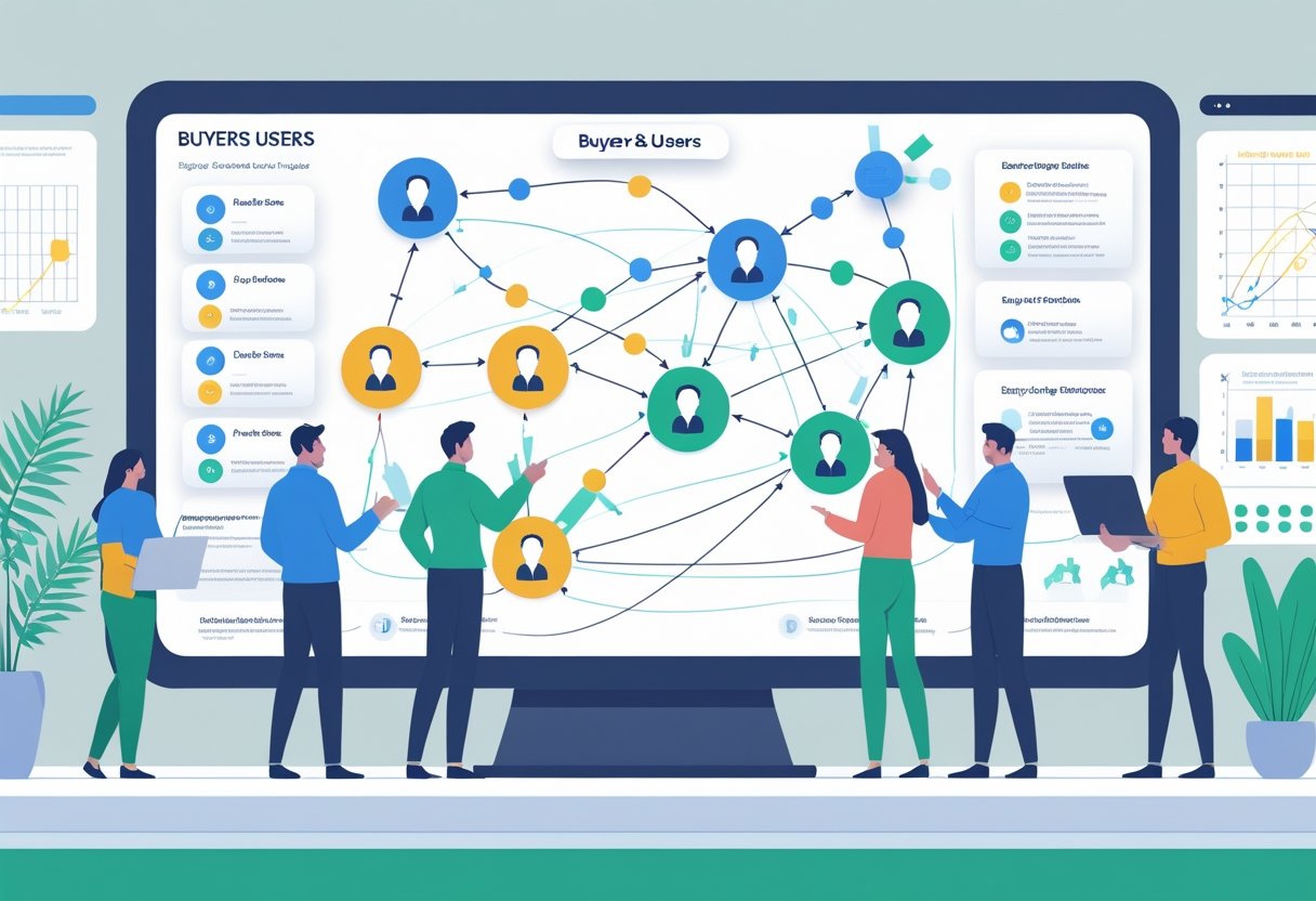
We’re always balancing user friction with getting sales context. Progressive profiling lets users see value fast but means we get company data later for sales outreach.
Full forms upfront make life easier for sales, but more users drop off before they even try the product.
For data, we sometimes use demo data to give instant value—no setup headaches. But there’s a risk users might think the product is just a toy.
Live data proves value instantly, but users have to connect their systems first.
Checklists spell out clear next steps. Tooltip tours are quick to build, but most folks forget them fast.
Quick calculation: does this change belong in “Now”?
Here’s a fast way to estimate your change’s impact over 90 days:
Activated users (90d) = Reach × Baseline × Lift × Confidence
Reach is how many new users will see your change in 90 days. Baseline is your current activation rate (decimal between 0 and 1).
Lift is the expected relative improvement—so for a 10% boost, use 0.10. Confidence is how sure you are: 0.25 for weak, 0.5 for moderate, 0.8 for strong.
Example: 50,000 reach × 0.40 baseline × 0.10 lift × 0.7 confidence = 1,400 extra activations.
If we need 3,000 more activations, this gets us 47% of the way there. That’s enough for “Now” status.
Patterns that consistently work
We focus on one clear path to activation right on the first screen. Each step gets just one call-to-action, and we keep secondary actions subtle.
Outcome-first copy wins, like “Invite a teammate to automate alerts.” We show sample data right away to highlight value, then ask for real info.
Our designs let users save their place and resume across sessions and devices. We build accessible UI—keyboard focus, labels, 4.5:1 contrast, and clear error messages all matter.
Realistic examples (≤5 lines each)
Analytics SaaS Company
- Problem: Only 38% of users activated because admin permissions blocked their first experience
- Solution: We added an “Explore a sample dashboard” option and created a simple checklist: connect one source → view sample → share chart
- Smart timing: We asked about team size after users had their “aha moment” and only showed security forms when they requested organization-level access
- Results: Activation jumped 6.4 percentage points, time-to-value dropped 44%, and user complaints stayed the same
- Safety checks: We kept accessibility issues under 0.5 per 1,000 monthly users and maintained our error rates
Personal Finance App
- Problem: Users left when we asked them to connect their bank accounts right away
- Solution: We started with a manual expense tagging demo and showed fake insights, then moved bank connection to step 3 with clear benefits explained
- New flow: Set budget → tag 3 expenses → connect bank (made optional)
- Results: Day 7 activation improved 4.1 percentage points, bank connections dropped slightly but user retention increased 2.3 percentage points
- Protection: We simplified our consent language and passed all accessibility standards
First-run building blocks (copy-ready)
Empty-state microcopy steers new users when they first land in your product. We tell them what dashboards do: “Dashboards show your team’s key metrics.” We explain the value: “Make decisions faster with live data.”
The main action is Connect a source. We offer a backup: “Or try a sample (2 min).” For help: “Watch a 40-sec setup video.”
Our activation checklist includes:
- Create your first project (auto-complete on success)
- Do the key action once (add rule, upload file)
- Invite one collaborator
- Optional: connect an integration
- See your success state (celebrate, email summary)
Progressive profiling schedule:
- Sign-up: email + SSO; consent
- After Aha: role/team; use case
- After activation: industry; company size
- Before paywall: billing; legal
Guardrails & ethics (non-negotiable)
We stick to strict privacy standards with data minimization and clear consent. Users can delete or export their data, and we avoid surprise collection during onboarding.
WCAG 2.1 AA accessibility is a must. That means keyboard access, visible focus, proper labels, good contrast, and captions.
We keep growth tactics above board—no forced trials, hidden usage meters, or sneaky countdowns.
We show value before asking for tough permissions. Kill switches and rollback tools protect us if onboarding changes spike errors or complaints.
Pitfalls & better alternatives
Tour carousels slow down onboarding. They often add unnecessary friction.
Mini FAQ
How many onboarding steps should we include? Try to keep it under five steps to reach activation. More steps usually lower completion rates.
If you need extra steps, bundle them or save them for later.
Should we build a product tour? Short nudges tend to work better. People pick things up faster when they do real tasks, not just watch slides or demos.
Is freemium or free trial better? Trials push urgency and help control costs. Freemium gets you more users and word-of-mouth.
Honestly, it depends—think about how quickly you get paid and how much support you can actually handle.
What makes a good activation goal? Every product category is different. Set a clear number and time frame, like 7-day activation ≥45%.
Keep working to improve that over time.
How do we find our Aha moment? Compare users who stuck around to those who didn’t. Try to spot the smallest set of actions that predict success.
Then, build your onboarding to nudge people toward that point.
Paste-ready rollout checklist
Set up events and dashboards to track activation, TTV, and step conversions.
Configure your feature flag for a gradual rollout—start with 5%, then move to 25%, 50%, and finally 100%.
Go through every empty state and checklist copy to make sure they’re clear and accessible.
Connect progressive profiling, and hold off on billing until users hit the value boundary.
Create alerts for error rates, complaint rates, and accessibility issues.
Keep a control hold-back of 5-10% for a week or two before you retire the old flows. That buffer can really save headaches.
Key rollout items:
- Events tracking activation metrics
- Feature flag configuration ready
- Copy reviewed for a11y compliance
- Progressive profiling connected
- Error and complaint rate alerts active
- Control group maintained during transition
Measure every step. If you want people to stick around, nailing onboarding is essential.